Showing posts with label Photoshop Tutorials. Show all posts

Friday, July 15, 2011

Tutorial For Adobe Photoshop CS5

Hopefully this week sometimes Adobe Photoshop CS5 Creative Suite 5 (CS5) will be officially released, but I can already exposed some of the new features in this tutorial dedicated to the latest version of Adobe Photoshop CS5.

The Photoshop team was to focus their efforts in improving two key areas for improvement as they have done to each and every one of the latest versions of CS. First, they take a look at what needs to be improved in CS4 - There is nothing better than feedback from users so that they have already spent a lot of time looking for the improvement of existing functions and CS4 applications.

Adobe Photoshop CS5 Tutorial


Thursday, June 30, 2011

Photoshop Tutorial : 5 Best Hidden Secrets

Whether you're just starting out with Photoshop or you're a seasoned pro, it's likely you've experienced instances where you wished a certain action was easier to do. This article will provide you with a few tips to consider as you explore Photoshop.

Keep an Eye Out for Tutorials : Is there a specific technique or command that's giving you a lot of trouble? In cases like this, sometimes it's simply not enough to consult the help file or ask questions online. Fortunately, you can find literally thousands of video tutorials that provide everything from shortcuts to the latest techniques on how to shade and texture.

Tuesday, June 28, 2011

How To Create A Grungy iPhone Application Advertisement in Photoshop

In this tutorial I will explain how to create a grungy iPhone Application advertisement using Photoshop CS5. The tutorial will be explained step by step, and will include all of the details and tips you will have to know in order to finish it correctly.

Step 1: Setting up the Document

Open Photoshop and create a new document with the below settings - Width: 1200px, Height: 760px. Click OK to get started.


Now we will create guides in our document. Make sure the rulers are on, View > Rulers (Cmd/Ctrl + R), and set the measurement units to Pixels by right clicking on them. Create a new guide, by clicking on the ruler and dragging the mouse. Drag the new guide to 40px. Do the same thing on each of the four borders.


Step 2: Creating the Background

Download the Vintage paper TEXTURE PACK and open Texture C. Place Texture C in your document. Stretch the texture to the borders of the document until it fits perfectly. Change its Blending Mode to Multiply. Open Texture A and do the same thing. Change Texture A's Blending Mode to Darken and set its Opacity to 60%.


Now we will create a Stripes Pattern. Create a new document (4px on 4px). Use the Pencil Tool (P) to create the following image:

step-002-2

After you've created the pattern press Edit > Define Pattern. Name your pattern however you like (I named mine "Stripes"). Now go back to the original document. Create a new layer above Texture A and name it Stripes. Choose Edit > Fill to fill the layer. Hitting Cmd/Ctrl + Delete (Backspace) also enables you to do this. By clicking the Cmd/Ctrl button you fill your layer with the Background Color. But, if you click the Opt/Alt key instead, you can fill your layer with the Foreground Color.

Back to creating the background. Double click Stripes (Or click Layer > Layer Style > Blending Options) and set its Fill Opacity to 0%. Then, go to Pattern Overlay and scroll to the bottom of your pattern list. Choose the stripes pattern. After you picked the stripes pattern change the pattern's Blending Mode to Multiply and set its Opacity to 10%.

step-002-3

The background is done! Just group the background's layers in order to make your layer section more organized. Name the background group "Textures".
Step 3: Creating the Background of the Application's Icon

Create a new layer above the group Textures. Group the new layer and name the group "App". Use the Rounded Rectangle Tool (U) and create a rounded rectangle with the following settings:

step-003

After creating the rounded rectangle click Layer > Layer Style > Gradient Overlay. Change the gradient's colors to #277282a and #5092a5. Now duplicate the rounded rectangle and decrease its width and height by 2px (90px on 90px). Double click on the decreased rectangle. Go to the Gradient Overlay section again and change the colors of it to #8dc2c4 and #c8f5ff. Now, After you have a pair of rounded rectangles, duplicate again the top one, or the brighter one, and decrease its width and height by 2px (88px on 88px). After you have decreased the rounded rectangle, change its Gradient Overlay colors to #49849d and #91ced9. Duplicate the top rounded rectangle and double click it. set its Fill Opacity to 0% and apply a Pattern Overlay with the stripes pattern from before. Now, select all of the rounded rectangles and align them horizontally and vertically.

If you have followed the steps correctly you are supposed to get this result:

step-003-2
Step 4: Creating the Person on the Application's Icon

Open your profile photo and select the area in which the head and shoulders appear. Apply a layer mask on the layer to hide everything except yourself. Notice! The selection you select does not have to be very accurate. Later on we will decrease the size of your image to a small size (about 90px on 90px), and we will apply a Color Overlay on it, so you won't be able to see the small details.

step-004

Drag your edited profile photo to the original document. Decrease the photo's size to about the size I did (See Below).

step-004-2

Then load the Stripes layer's selection, and apply a layer mask on you photo's layer. Then, double click the Profile Photo's layer and apply the following styles:

step-004-3

We're almost done with the icon! The only thing left is to create a highlight layer. Create a new layer above the Profile Photo and name it Highlight. Select the Ellipse Tool (U) and create a white ellipse above the rectangles and the photo. It should look like this:

step-004-4

After creating the ellipse apply the following Layer Styles on it:

step-004-5

If you finished applying the Layer Styles on the Highlight layer you're almost done! The only thing you have left to do is to apply a Layer Mask on the layer and to apply a Drop Shadow effect on the bottom layer.

Click and drag, while holding Opt/Alt, the Layer Mask's thumbnail of the Stripes layer on to the Highlight Layer. After applying the Layer Mask double click the bottom layer and go to the Drop Shadow section. Apply the next settings:

Step 5: Creating the Download Button

Before we start creating the Download Button, go to the Futura Font link in the resources and download the following weight of the font: Light, Medium, Bold, and Extra Bold.

Let's get started! Now, we will create the button with the same technique I showed you in Step 3. Create three new rounded rectangles with these sizes: A. 302px on 76px, B. 300px on 74px, and C. 298px on 72px. Apply on the three rectangles the Layer Styles we used in Step 3. Then, duplicate the top rectangle and apply the Settings and Layer Styles we have applied on the Stripes layer earlier.

step-005

Select the type tool. Use the Futura Font and select the Extra bold weight. Type "Free Download!". Use font size 22pt. Then, apply the style which we used on the Profile Photo. And after applying the styling options align all the layer horizontally and vertically. Just apply the Drop Shadow effect, that we applied on the bottom layer of the app, on the bottom layer, and you should get this:

step-005-2

If you got the result I did, group the button layers and name the group "Button".
Step 6: Type the Download Description Text

Select the type tool again. Use the Futura font with Black color, Light weight, and 30pt size. now write: "Download the new iDeitch App for FREE.". Change word "iDeitch"'s weight to Medium.

step-006
Step 7: Create the iTunes Store Icon

First create a rounded rectangle. width 147px, height 48px, and background color #6d6d6d. Then type "Available on the iPhone"' using Myriad Pro, in size 7.5pt and "iTunes Store" in size 18pt. Then create another, smaller, rounded rectangle which will be the iPhone later. Set its width to 18px and height to 32px. Then, Create a rectangle above the rounded rectangle which represents the screen of the iPhone (13px on 19px). After that create a circle which stands for the menu\back button (3px on 3px). Afterwards, load the selection of all the layers (except the background) and apply an Invert Layer Mask by Opt/Alt clicking the Layer Mask button. Then load again the selection of the screen and the menu button and fill the selection with White in the Layer Mask of the Background. And finally, group all the layer and name the group "iTunes Store"

step-007

Now just group the layers and groups: "iTunes Store", "Download the new iDeitch App for FREE.", "Button", and "App". Name the group "Download".
Step 8: Place our Icon in the iPhone

Open the iPhone file. Before dragging the whole iPhone document to our project I want you to hide the following layers:

step-008

After deleting the layers I showed you, group the layers left (without the background) and name the group "iPhone". Then, drag the iPhone group to our document and decrease its size to 348px on 680px and drag it until it lays besides the guides on the left.

step-008-2

Duplicate the group App and drag it into the iPhone Group, then into "Springboard Components" and then into "Springboard Icons". Then, decrease the group "App copy" by 45% (till 55%), hide the Drop Shadow effect from the bottom layer, merge all of the App copy group, and apply the Drop Shadow effect again. After that, write "iDeitch" with the following settings, and then apply the same Drop Shadow effect to the text:

step-008-3

Rename the app icon to iDeitch and group the app icon and the text which says "iDeitch". Name the group iDeitch.
Step 9: Add the comment on the iPhone

Select the type tool. type "Download Now!" with Cheyenne Hand Font, font size 16pt. Then rotate the text layer 25 degrees clockwise.

step-009

Now we're going to create the arrow. Create a new layer. name it "Arrow". Select the Pen Tool (P) and create the following path:

step-009-2

Now select the Brush Tool (B) and select the default round hard brush. Change its size to 2px. Make sure the Hardness is 100% and that your Foreground Color is black. Switch back to the Pen Tool and right click the path we have created a second ago. A new menu is supposed to open up where you have right clicked. Pick "Stroke Path". Now we have finished the arrow itself. Let's create the head of the arrow: Create the following path and repeat the steps we did to create the body of the arrow:

step-009-3

Group the "Download Now! comment and the Arrow. Name the group "Comment" and drag it into the top of the group iPhone.
Step 10: Create the Colorful Title and Background

Open the Cloud Brushes brush set. Create a new layer under the group Textures. Name it "Clouds". Select the first brush in the brush pack and paint the layer as shown below, with the colors #ffed21, #fd43f2, #3fcbee:

step-010

After finishing the background create a new layer. Select the Type Tool (T) and write "iDeitch" with the settings below. Then, type "NEW APP" with the other settings below, on a different layer. Use the color #ffed21. Then group the two text layer and name them "Yellow". Duplicate "Yellow" and rename it to "Blue". Move the Blue group a little to the right and up and apply on the layers the following Layer Styles:


After applying the Layer Styles group the groups Yellow and Blue and name their group "Title".

Step 11: Create the "Made By Ofek Deitch" Sign


Create a new layer and group it. Name the group "Made By". select the layer we have just created, and using the Type Tool (T), write "Made By" with the settings below. Then, Create another layer and type "OFEK" (The settings are found below). Create another last layer and type "DEITCH" with the setting below.


Rotate the layer that says "OFEK" 90 degrees CCW (Counter-Clockwise). Arrange the layers like this:


Create a new layer. Select the Type Tool (T) and type: "Copyright © 2011 by Ofek Deitch. All rights reserved.". Before typing, change the Type Tool's settings to the following ones:


Before we even start organizing our layers, have a look on how our layers are supposed to be ordered:


Let's start! First things first, hide all the layers except Background and Textures. Then, show the layer Clouds. After that, show the iPhone group. Make sure the iPhone is aligned to the left guide and is vertically aligned to the center of the document. Afterwards, show the Download group but hide all the layers and groups inside it. Show the group Button. Align it to the bottom guide and near the right guide. Then, show the iTunes Store group and align it to the the right guide and align it, vertically, to the center of the group Button. After that, show the text layer inside the Download group. align it to 50px above the Button group and align it, also, to the same X value (so they start together). Then, show the App group. Align it, horizontally, to the center of the text layer, and vertically to the center of the iTunes store group.


Before you continue, check according to the image above if you have done the previous step correctly until now. If so, then great! You can continue! But if not, then find what you have done wrong and fix it.

Let's continue! Show the group Title. Click Cmd/Ctrl + T to Free Transform the group. On the top left you will see this bar:


Change the X and Y values to the same as shown on the image above. Now show the "Made By" group.


Change the X and Y values to the same as shown on the image above. And finally! Show the copyright layer and horizontally align it to the left guide. Then, vertically align it to the center of the area between the bottom border of the document and the bottom guide.

Final Result :

Thursday, June 2, 2011

Teknik Menggandakan Diri ( Twins Effect )

Tutorial Photoshop kali ini adalah tentang techniques menggandakan diri, wah kayak amoba dong! hehehe ya begitulah tapi kalau amoba kan dia memang benar - benar menggandakan diri namun kali ini kita tidak perlu pakai jurus ninjutsu ala naruto atau jurus magic tricks. How could such? what is the secret? cukup sebuah tripot dan camera dan tentu saja Photoshop

kok bisa tripot? kalau nggak punya tripot gimana? cukup camera saja cuma kita harus membuat dudukan / tempat agar camera tersebut tidak bergerak kemana - mana

Ok, here's the trick ...
1. Pertama kita ambil dulu bisa 2 photo 3 photo maupun lebih, namun untuk contoh saya pakai dua photo saja biar terkesan twin efek (efek kembar) gitu
maunya sih photo pakai sendiri tapi berhubung penulis bukan seorang fotogenik jadi ya terpaksa saya pakai foto orang lain saja

Cklik photo 1


Cklik photo 2


angle (sudut) dan letak foto sama persis, inilah gunanya tripot
bagi yang belum tahu tripot ini dia gambarnya


okay now it's time beraksi dan Learn Photoshop,

2. Pindahkan photo yang kita punya ke komputer / laptop lalu buka photo-photo tersebut dengan PHOTOSHOP disini bisa menggunakan berbagai jenis photoshop mulai dari photoshop 7 hingga yang terkini yaitu CS 5

3. Dengan Move Tool
Pindahkan foto orang bertopi ke photo orang yang tidak bertopi


4. Nah sekarang kita ganti blending modenya ke mode Screen jadi kelihatan transparan nih, hehehe


5. Nah berikutnya siapkan / klik eraser Tool


6. sekarang hapus image orang yang tidak bertopi


namun hati - hati jangan sampai kena area orang yang bertopi

7. Jika merasa sudah pas penghapusannya, sekarang kembalikan blending mode ke Normal
mau tau hasilnya? bener, mau tahu? jamaah yeee oh jamaah yeee Alhamdulillah


wow kembar , efek ( twin ) brother
Tutorials ini hanyalah merupakan contoh saja, anda bisa mengembangkan effect diatas menurut imajinasi anda


ini kreasi image lainnya..

Terima kasih telah belajar bersama ilmuGrafis, sampai jumpa lagi di Photoshop Effects lainnya
good luck...

Source  : Ilmugrafis.com

Saturday, May 14, 2011

Photoshop: Creating Cartoon Effects Photoshop

Turning your photo into a cartoon web face is one of the hottest online trends throughout the social networking world today. Cartoon avatars serve as a unique way of branding your personal identity in a variety of online communities like Facebook, MySpace and many others. There are many different ways of creating a cartoon picture by digitally manipulating a photograph of your face. Methods range from professional graphic image editing techniques using Photoshop or Illustrator to fully automated online website systems.

Tutorial ini dibuat sebagai jawaban pertanyaan Mas Bugishq, yang menanyakan pembuatan kartun pada Photoshop Tutorials.

Pada pembuatan kartun di Photoshop, banyak melibatkan penggunaan palet layer (jadi jangan heran kalau nanti palet layer kita akan terlihat sangat ramai), juga kita akan menelusuri sisi gambar secara manual dengan menggunakan pen tools ini membutuhkan kesabaran - online photoshop.

Palet Layer : Jendela mengambang pada layer, yang berisikan gambar independen yang saling menumpuk satu sama lain.

Step 1 (One)
Buka foto dengan Photoshop
Di sini saya menggunakan poto sahabat saya ’Cristiano Ronaldo”. Atur tingkat terang gambar dengan pilih Image > Ajustments > Brightness/Contrast ... (usahakan gambar jangan terlalu gelap untuk memudahkan melihat perbedaan warna.


Step 2 (Two)
Gandakan layer, caranya tekan ctr + J, untuk membuat backup gambar jika sewaktu-waktu kita memerlukan gambar asli.

Step 3 (Three)
Karena kita akan menggambar secara manual, maka kita harus mengurangi jumlah warna pada foto
caranya pilih menu Image > Ajustments > Posterize ... pilih angka 3 atau 4.

Lalu gandakan lagi gambar yang sudah di posterize tadi (ctr + J), pilih Menu Filter > Blur > Gaussian Blur, tujuannya untuk mempertegas perbatasan antar warna untuk memudahkan menelusurinya
tutorial photoshop effect


Step 4 (Four)
Sekarang kita mulai untuk menelusuri gambar, pilih Pen Tool tampak baris pilihan berubah saat kita memilih Pen tool. Baris Pilihan mengandung setting-setting yang bisa digunakan untuk memodifikasi perilaku tool yang sedang aktif. Pada Baris Pilihan pilih Shape Layer, yang mengijinkan kit membuat path pada sebuah layer baru. Atur warna.

Buatlah shape mengikuti area warna pada gambar, ulangi untuk membuat shape pada area warna yang lain
Hasilnya:


Untuk memudahkan menggambar, kita bisa atur tingkat opacity gambar pada palet layer bahkan bisa diatur pada angka 0. Untuk mengubah warna pada setiap layer shape, lakukan dengan cara melakukan klik 2 kali pada thumbnail layer-nya. Kemudian pilih salah satu warna


Jika ada layer menutupi gambar yang sedang kita buat, kita bisa menyembunyikan layer yang menutupi gambar kita dengan menonaktifkan gambar mata yang terletak disebelahnya

ulangilah lagi membuat bentuk shape pada semua bagian tubuh, hingga keseluruhan foto tertutup oleh bentuk-bentuk shape

Untuk membuat background, kita bisa membuat layer baru dan diletakkan pada posisi bagian bawah, atur warnanya sehingga terlihat menarik

Hasilnya:


Step 5 (Five)
Jika semua gambar akan dijadikan satu, bisa dilakukan dengan memilih menu Layer > Flatten Image
Selamat mencoba, semoga bermanfaat...

Before and After (sebelum dan sesudah)


Good luck ... ^_^

Monday, May 2, 2011

Getting a Free Adobe Photoshop Tutorial


Photoshop tutorials - In the world today, almost nothing is free. Even oxygen is being sold in bars. It is quite comforting, therefore, to find out that you can still get the gift of knowledge without having to pull out your wallet. Getting a free Adobe Photoshop tutorial is equal to getting a very precious gift when it's not even your birthday.

Did you know that a lot of companies today are hiring people with knowledge in Adobe Photoshop? This is because of the fact that Photoshop is the most widely-used image manipulation program today. This means that getting a free Photoshop tutorial will help you avoid the problem that most people are facing today: unemployment. Because of free tutorials, you would be able to increase your chances of being hired. And it won't even cost you a dime!

There are many ways through which you can obtain a free tutorial. The first way actually comes automatically when you buy the program. Adobe Photoshop actually comes with a free tutorial.

This means that you don't really have to look farther than your own computer to obtain a free Adobe Photoshop tutorial. There is, however, a problem with this type of free Adobe Photoshop tutorial. Some people find it boring and hard to understand. This is because the basic free Adobe Photoshop tutorial comes in the form of a text file. This means you have to read about what you should do and then find out how to apply what you read.

Another source of free Photoshop tutorials is the internet. Most free tutorials being offered in various websites are written by users who have managed to decipher the basic tutorial and who now wish to share their knowledge to other people.

The problem with this is that most tutorials are focused on something cool that the user has learned how to do. It is hard to find an online manual explaining every detail of how the program works. Unless, of course, you check out Adobe's website, which brings you back to square one.

You should also try to find interactive or video tutorials. This is because these types of free Adobe Photoshop tutorials can show you how to do stuff, not just tell you. You would be able to grasp concepts much easier and much faster.

This is because the medium of instruction allows you to actually see how the instructions would be translated into actions. However, one disadvantage of this is the fact that you will not be able to find answers to questions that the creator of the tutorial wasn't able to anticipate.

An alternative to this is you could also ask someone who knows how to work the program to teach you how to use it. This way, you would get a free Adobe Photoshop tutorial from a source that you can trust. You would be able to ask questions about certain procedures that you cannot understand. This way, the entire learning process would be more productive for you.

As you can see, there are many things that you can do in order to get free Adobe Photoshop tutorials. Just because you do not have money does not mean you are out of resources. Use everything that you can and you will be able to find the free Adobe Photoshop tutorial that you need.

Sunday, April 24, 2011

How to Use Free Photoshop Video Tutorials


Free Photoshop video tutorials are a great way to learn how to use the Photoshop program. They say that if you listen you forget, if you see you remember and if you do you understand. Well, by listening and watching video tutorials about Photoshop, and following along in your own program, you are doing all three together.

By watching an expert operate the Photoshop program you have the best chance of learning, and also remembering and understanding what you have learnt than by any other learning method.

And Photoshop Tutorials video are nothing else but movies of the expert operating the Photoshop program. You are effectively 'looking over the shoulder' of the expert and watching every click of his mouse.

You can read instructions, manuals, books by other authors, and Internet websites about Photoshop. But to learn quickly and clearly nothing beats learning from Photoshop video tutorials.

With Photoshop video tutorials, you can see how buttons, collages or even paintings and indeed complete websites - yes websites - are created. Instead of laboriously reading through books describing what needs to be selected, activated and clicked, you can simply imitate the mouse movement and clicks performed in the video knowing that you are actually doing exactly the right thing.

The learning curve is easier to climb and the results are easier to compare.

Not only that, you can watch how it is done from the very beginning to the very end and sometimes you can even have explained why it is done in that particular way.

Sean Dodge wrote on his blog and article called "5 Important Criteria that Make a Great Photoshop Tutorial". But Sean is writing about screenshot-and-text step-by-step tutorials, not video tutorials. In fact, I haven't yet found an article discussing the format of Photoshop video tutorials.

Did you ever make a Photoshop mock-up of a website design before getting down and dirty with the code? Then consider the the SiteGrinder program.

Basically, the SiteGrinder program turns Photoshop into an easy-to-use and fully functional web design tool. With SiteGrinder, designers will now have the freedom to totally let their creativity loose and then, without skipping a beat, transfer their designs to the web.

SiteGrinder lets you design web pages with dynamic text, e.g. served from a database and 'poured' into a web page containing code. Examples are weblogs and Content Management Systems content. It is hard to believe that a Photoshop plug-in should be capable of doing so, but it can be done and quite easily.

There is a collection of free video tutorials showing the proper use of various SiteGrinder techniques to build web pages from Photoshop documents.

There is no way that the same information could be imparted so effectively except through the medium of video tutorials.

A PSDTUTS tutorial from Fabio shows how your can recreate a realistic-looking watercolor effect with Photoshop brushes. Fabio demonstrates how the hair can be re-made with the popular watercolor brushes from Bittbox. This tutorial is static screenshots and written text. I think it would be much more interesting and beneficial if it had been a Photoshop video tutorial instead.

Another Photoshop tutorial from Fabio shows how to "Create a Spectacular Flaming Meteor Effect on Text". But again, it is a screenshot and text tutorial not a Photoshop video tutorial.

With Photoshop Video Tutorials you can learn how to get more consistent color with the videos on color management as it relates to Photoshop. Resources include detailed information on color calibration, using ICC profiles, and how to get consistent color results from Photoshop.

This means that you can prerecord actions or processes in Photoshop that you can then save and turn into a button that you can then simply click and Photoshop will do the whole action for you. It's mainly used as a timesaving device and saves the hassle of doing menial work like basic Photography fixing or cleaning your scans so you don't have to do it over and over again because you can just click a button you created.

The procedure to do this is explained in the Photoshop video tutorials.

If you execute a huge zoom you can make Photoshop pause a moment while it figures out what to draw. Photoshop CS4 has none of this: zooming in from 3% to 1600% is so fast and smooth it's like you're falling into the image.

The File Browser was introduced as a major update to Photoshop 7 and was later improved in Photoshop CS. When a directory is viewed for the first time, the File Browser or Bridge will build a cache of the image previews.

Plugins can be opened from within Photoshop and act like mini-editors that modify the image.

As to storing your Photoshop images, RAID 0 is very useful for temporary data such as page files and Photoshop scratch disk placement. It is not recommended for files you need to keep.

There are many websites about various aspects of Photoshop, but to find them all and to learn what is on each one can be very time consuming. Luckily there is one website that has done a lot of the searching for you. That particular website hosts hundreds of Photoshop video tutorials and they are all free to watch.

The tutorials have been pre-selected for their relevance and quality by the website owner and arranged in logical groups depending upon the subject covered so that it is easy for the user to quickly find the best Photoshop video tutorial that answers his questions.

Thursday, April 21, 2011

What Makes a Good Photoshop Tutorial?


Very good photoshop tutorials should introduce the exact same concept and principle you're making use of as a graphic designer. Composing, following all, is relatively related to design. Both have a purpose to communicate with the audience. Keeping that in mind is really a surefire strategy to grab the reader's interest. Here are several values you'll want to obtain.

Technique. An excellent Photoshop classes should impress the viewers with its rarity. Dozens of tutorial writers on the web are vying for your readers' have confidence in and curiosity. There are visitors who just need to discover some thing new. A number of them may possibly just wish to produce a style that they are able to brag about. Attempt providing them what they request for by experimenting.

Photoshop training courses - Get inspirations elsewhere. There's nothing wrong with picking up a few tactics from a movie poster or an album cover you have observed. Reality is the fact that nothing is unique. Interpretations are what issues on this post-modern globe. Being a designer, everything that we do can be a recreation of other people's performs no matter whether we are aware about it or not.

So what precisely do we mean by rarity? We are speaking in regards to the final effects. The results by yourself can lure a novice designer into reading your online photoshop. People who have genuine curiosity in style would often desire to know how a certain effect is created. These folks, who've enthusiasm for technique, are what the business will need. They may possibly also be your audience.

Features. If first suggestions make the style fascinating, perform offers its worth. As opposed to painting that stands in by itself, the good quality of the graphic design leans around the purpose it shall serve. Subjects of excellent Photoshop tutorials ought to often hold the audience in thoughts. Rules of aesthetics and components of artwork issue a lot but additionally to that, graphic designs have to make all these function to achieve an ulterior motive. Graphic design is always a propaganda. Photoshop customers will need a tutorial that they can in fact utilize apart from its ability to entertain them.

Focus to Detail. Buy photoshop tutorials should be published with a novice consumer in mind. Some might think that this kind of method seems as if the writer is underestimating the abilities with the readers. The thing is the fact that Photoshop tutorial writers aren't talking to just one audience. It's challenging to determine the talent ranges of the majority. If erring is inevitable, then may as well err around the aspect of explaining too much. Excellent styles, after all, might be seen depending on the particulars. Tutorials that expound on each and every detail are not only considerate. They also manifest the writer's skills as a graphic designer.

Nonetheless, every single stage needs to be explained completely yet concisely. The whole tutorial really should illustrate the values viewers must acquire to attain the last impact.

Brevity. Considerably like in graphic design, Photoshop tutorials really should also attempt to eliminate clutter. An excessive amount of pointless data may possibly leave the readers confused. Which will only result in the failure of one's tutorial nonetheless fantastic the last result is to them. 1 worth of a fantastic graphic design that also applies within the realm of content material composing will be the capacity to simplify without having missing out on crucial particulars. With out unnecessary clutter, the needed is emphasized. Tutorial writers ought to often try to concentrate on the instructions. Writing Photoshop tutorials is far from mere blogging. Here, you're communicating directly to an audience who requirements info. You might be not just expressing yourself. You're teaching.

It doesn't imply though that you have to be all formal about this. In fact, it is finest to use a a lot more conversational tone to ensure that the viewers can simply relate to what you're declaring. The critical thing is which you are obvious and immediate for the position. No more metaphors or cryptic messages. The energy of a good tutorial lies in being comprehended.

Saturday, December 25, 2010

Mengenal Resolusi Photoshop

Pada pembuatan document baru untuk Photoshop secara default adalah color mode, RGB resolusi adalah 72 pixel/inch. Bagi disain pemula mungkin belum begitu mengerti tentang color mode RGB resolusi tsb. karena dengan resolusi 72 pixel/inch akan berakibat image kurang maximal untuk cetak/offset dengan Lpi 150/175. Untuk standar cetak pada umumnya file Photoshop adalah resolusi 300 pixel/inch, bukan per cm untuk pemakaian file 100%. Tutorial Photoshop


Memang untuk tampilan di monitor untuk file resolusi 72 dpi atau 300 dpi tidak begitu kelihatan, tapi untuk hasil cetak 150/175 lpi jauh berbeda. Sedangkan untuk color mode RGB dengan CMYK akan menghasilkan warna yang berbeda pada hasil cetaknya. Dengan begitu kalau misalkan anda disain mungkin kalau boleh saya sarankan untuk file Photoshop color mode CMYK dan Resolusi 300 DPI. Mengenal Resolusi Photoshop
Semoga penjelasan di atas bermanfaat

Thursday, December 23, 2010

Cara lain menghaluskan Wajah dengan Photoshop

di Tutorial photoshop yang lama saya sudah buat cara menghaluskan wajah yang judulnya menghilangkan kerutan di wajah.. di tutorial itu saya pake cara healing brush tool..
Sekarang saya mau coba dengan cara menghilangkan jerawat dengan Photoshop atau menghaluskan muka tanpa meng clone ataupun healing.. tapi dengan blur filter.
Buka foto yang mau dihaluskan wajahnya..


duplikat layer background atau layer gambar dengan menekan ctrl + J
ubah layer style menjadi vivid light.


Klik Image > adjustment > Invert atau tekan CTRL + I


Klik filter > blur > gaussian blur
Nilai radius tergantung gambar.. usahakan hasil blur nya sama yaa dengan yang digambar


Klik filter > other > high pass .. sekali lagi nilai radius tergantung besar gambar nya.. jadi dikira-kira aja wajahnya udah mulus apa belom..  :) .. kalo ada perubahan pada mata.. biarin aja.. nanti dimasking kok..


Kalo udah keliatan halus muka nya.. klik  Add layer mask ..
warna foreground harus hitam..


Klik brush TooL .. warnai bagian-bagian yang harusnya tajem.. seperti alis, mata, bibir, hidung, rambut, baju… kecuali daerah yang ada jerawarnya.. jangan di masking.


hasilnya :


Ini contoh yang lain :


Gimana ? gampang kan ?
Selamat mencoba yah..
Sekali lagi

Tutorial menghaluskan Wajah dengan Photoshop

Saat ini saya akan membagikan tips mengenai cara menghaluskan wajah dengan photoshop, pasti teman2 senang karena tips ini sangat membantu apabila teman2 tidak pede akan foto wajahnya yang banyak jerawat atau ada flek-flek hitam diwajah, kalo fotonya kinclong kan pasti ridho dan ikhlas di upload di facebook atau di friendster, by the way katanya facebook haram ya? hayah dibahass..., foto wajah ini dapat diperbaiki di photoshop dengan menggunakan cara clone stamp tool dan gaussian blur.
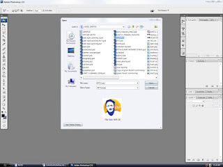
Pertama tama siapkan file foto yang mau diotak atik, dengan cara double klik di layar abu-abu lalu browse foto yang mau kamu benerin wajahnya. Berikut cara menghaluskan wajah dengan Photoshop :


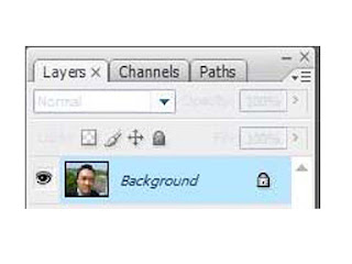
kalo fotonya sudah masuk photoshop lihat dikanan bawah dibagian layer, terlihat layernya masih digembok, cara buka gemboknya gampang tinggal dobel klik aja lalu ok,

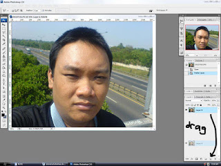
Abis itu copy layernya dengan cara klik “ctrl+j”, nah layer yang mau diotak atik itu adalah layer yang sudah dikopi tadi, kalo layer 0 nggak usah diapa2in, kalo perlu matikan saja dengan mengklik tombol mata disampingnya.


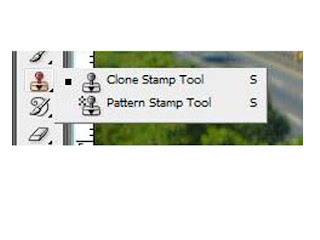
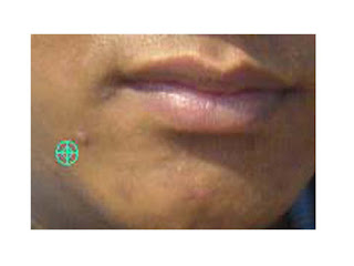
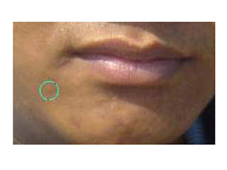
Nah perjalanan anda akan dimulai disini, bersiaplah berpetualang menuju kulit halus berseri indah rupawan bak putri raja, “SIAAP”, “LETS GO!!!”, pertama2 injek kopling... eh salah... pertama2 hilangkan jerawat dengan clone stamp tool itu loh tombol yanggambarnya stempel pak lurah, klik tombolnya lalu atur besaran kepala stamp dengan mengklik tombol di keyboard { untuk memperkecil, atau klik } untuk memperbesar,

besaran kepala stamp diusahakan sebesar jerawat kamu, kalo jerawat kamu diameternya 2 mili ya kepala stampnya juga dua mili atau lebih, intinya zoom jerawat kamu terus deketin kepala stamp lalu atur besar kepala stampnya dengan klik { / } mudah bukan, hohohohohoohoo....

Kalo besaran kepala stamp dirasa cukup tinggal klik alt trus klik disebelah jerawat kamu, lepas alt nya, lalu klik kursor dijerawat kamu, voila...jerawat kamu hilang dalam beberapa detik, nggak usah facial nggak usah pake obat anti acne segala, intinya adalah ngopy kulit yang bagus terus di tambal ke jerawat kita, jadi main tambal sulam gitu hehehehe...., itulah kehebatan photoshop, program yang didesain untuk memodifikasi dot dan pixel dalam komputer, berbeda dengan software vektor lain yang berbasis garis, sedangkan photoshop berbasis dot.


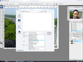
Kalo gambar wajah kamu sudah hilang dari jerawat2 yang meresahkan jiwa tinggal save as gambar kamu menjadi gambar jpg, jangan lupa beri nama “jerawatku hilang” (terserah sih mo dinamain apa), nah kalo sudah di save as gambarnya jadi jpg, mari kita lanjutkan ke step dua yang lebih menakjubkan dan lebih mendebarkan dari apa yang sudah dibayangkan dan dari apa yang sudah didamba2kan.

save as JPG


Lanjut ke step dua (gaussian blur)
Gambar kamu yang sudah diedit jerawatnya kini akan di modifikasi kembali dengan cara, buka file kamu dengan cara double klik dilayar abu2 lalu browse file “jerawatku hilang”, kalo udah kepasang fotonya mari kita mulai sesi penghalusan wajah.
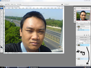
Pertama2 copy layer dengan kontrol J (ctrl+j), layer 0 jangan di otak - atik untuk persediaan gambar, pakai layer yang dikopi tadi untuk dimodifikasi,

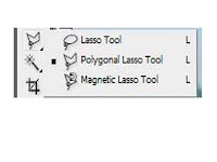
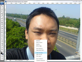
klik layer yang mau dimodifikasi dikanan bawah, setelah itu seleksi kulit wajah yang mau dihaluskan, misal kulit pipi sebelah kiri, seleksi kulit wajah itu dengan poligonal lasso tool, bila sudah terseleksi maka klik kanan di daerah seleksi lalu klik layer via copy.


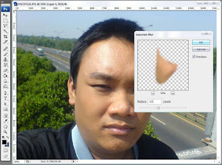
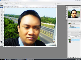
maka kulit wajah akan tercopy, setelah tercopy haluskan dengan cara klik filter > blur > gaussian blur tentukan besaran blur sampai dirasa cukup halus, klik ok maka voila... wajah anda akan menjadi halus bak putri raja, ulangi dibeberapa bagian hingga terlihat halus.


Dan hasil akhir akan terlihat seperti ini :


ingat bagian yang di blur adalah kulit yang sewarna dan senada, adapun bagian2 yang tidak boleh diblur adalah bagian ini :

  1. bagian mata : kalo diblur nanti mata anda terlihat seperti mata pocong putih semua
  2. bagian garis wajah : nanti kalo di blur muka anda akan terlihat rata seperti hantu
  3. bagian bibir : nanti bibir bisa hilang dan nggak punya bibir (kasian pacar anda nyariin)
  4. bagian rambut : nanti rambutnya bisa halus kayak karpet

Bagian2 yang boleh diblur adalah :
  1. kulit wajah
  2. pipi bagian kanan dan kiri
  3. jidat
  4. hidung
  5. dagu
  6. leher
  7. lengan
  8. paha (loh udah kebablasan)

before

after


Itulah tadi tips bagaimana cara menghaluskan wajah dengan photoshop, kalo pusing sama cara diatas tadi, nggak usah bingung, tingga replay ntar gw bantuin.

LinkWithin

Related Posts Plugin for WordPress, Blogger...